At RoleModel, design is about collaboration.
Optics embodies the RoleModel ethos of deep collaboration, uniting our team's diverse expertise with the shared goal of crafting excellent design solutions and our commitment to Character, Collaboration, and Craftsmanship.
Optics supports our mission of serving business innovators excellently by crafting sustainable software systems.
The Vision
We needed a system that would propel our projects forward, with a foundation for continuous evolution through active collaboration with our developers and designers. Optics was born from the insight that a unified design and development framework propels our projects to greater heights while providing excellent and consistent outcomes for our clients.
Harmonize Design and Development
Optics bridges the gap between design and code by fostering a shared language. It's where aesthetic precision meets technical finesse, ensuring that designers and developers are in sync, crafting seamless experiences. An example of this is our semantic color token system based on luminosity, ensuring contrast standards for accessibility are met early in the design process while providing the flexibility to produce visually exciting designs shared with our development team.
Elevate Design Flexibility
Optics is our answer to the evolving needs of design at RoleModel. By integrating a versatile design system with a collection of adaptable components, Optics enhances our ability to tackle unique project challenges. It offers customizable solutions that uphold our commitment to precision and flexibility in every project.
Crafting Accessible User Experiences
At the heart of Optics lies our dedication to accessibility and cohesive user experiences. Our comprehensive Figma component library, along with HTML/CSS components, ensures that every design meets the highest standards of accessibility. Allowing us to create designs that are not just visually appealing but also accessible and aligned with our clients' brands.
The Core
Optics is built on three core pillars: our Figma Component Library, HTML/CSS components, and thorough Documentation.
Figma Component Library
In Optics, the component library is crafted to give our team precise specifications for each component, fostering consistency across projects. This comprehensive library streamlines our development process, enhancing efficiency while maintaining a high standard of consistency in our work.
HTML/CSS Components
Our HTML/CSS components provide the foundation for our user interface development. Each component adheres to our best practices for development and accessibility. These components are highly configurable and designed to work hand in hand with our Figma component library to ensure what we design is what we deliver every time.
Documentation
We have documented each of our HTML/CSS components to demonstrate how and when to use each component while providing a playground for our development team to experiment with the various capabilities and configurations of each. In addition to this, our documentation has a growing list of code best practices, training materials, and code recipes.
Design Principals
Optics speaks to a set of core design principles that guide our team. These principles are the foundation of our approach to creating digital products that are both functional and compelling. With Optics we achieve our design goals early in the delivery process setting a great foundation.
Customizable and Flexible
The ability to adapt and customize components to meet the unique requirements of various projects, while maintaining flexibility to fit into different development tools.
Consistency and Standardization
Establishing a consistent design foundation across projects, with standardized approaches in design and implementation to enhance overall impact.
Highly Collaborative
Facilitating tight feedback loops between designers and developers to build upon the design foundation incrementally and collaboratively.
Accessible and Usable by All
Prioritizing excellent accessibility in designs, ensuring that solutions are user-friendly for all potential users.
Foundation
The core suite of design elements that anchor our system. It's a collection of guidelines ensuring our designs are accessible, visually coherent, and meticulously structured. Each principle, from accessibility to spacing, is a building block for creating designs that are both beautiful and functional.
Accessibility
Accessibility is the cornerstone of our design philosophy, ensuring that our products are usable by everyone. We rigorously adhere to WCAG standards, creating designs that cater to a wide range of abilities and assistive technologies.
Color
Optics gets its name from how we modify color akin to photographic f-stops throughout a luminosity range. As part of meeting our accessibility standards, we’ve designed this robust color system to ensure contrast standards for accessibility are met while having the needed flexibility to provide visually exciting designs with rich color palettes.
Typography
We begin with the default: Noto Sans, a versatile and modern typeface that's as functional as it is beautiful, accessed through the Google Fonts CDN for ease and efficiency. This choice provides a solid foundation for readability and accessibility, ensuring the text is clear, and legible as it is aesthetically pleasing.
Icons
Optics has crafted a suite of icon classes that are built upon the foundation of Google's Material Symbols Icon Font. This choice ensures a familiar and intuitive user experience, leveraging a tried-and-tested icon set known for its clarity and consistency.
Design Tokens
Each token follows a clear pattern. This systematic approach guarantees that any new tokens introduced will integrate into our existing system. We share these tokens between our Figma design files and our development codebase to ensure accurate deliveries that consistently match the design intent.
Spacing
Utilizing tokens, enables us to maintain a consistent spatial structure throughout the project, leading to a more aesthetically pleasing and functionally sound product.
We know that each time we reach for something within our design system, it's going to work.
Figma Component Libraries
We've crafted an extensive component library that empowers our team to grasp the precise specs of each component and apply them with uniformity across all our projects. It enhances both the pace at which we develop and the consistency we deliver.
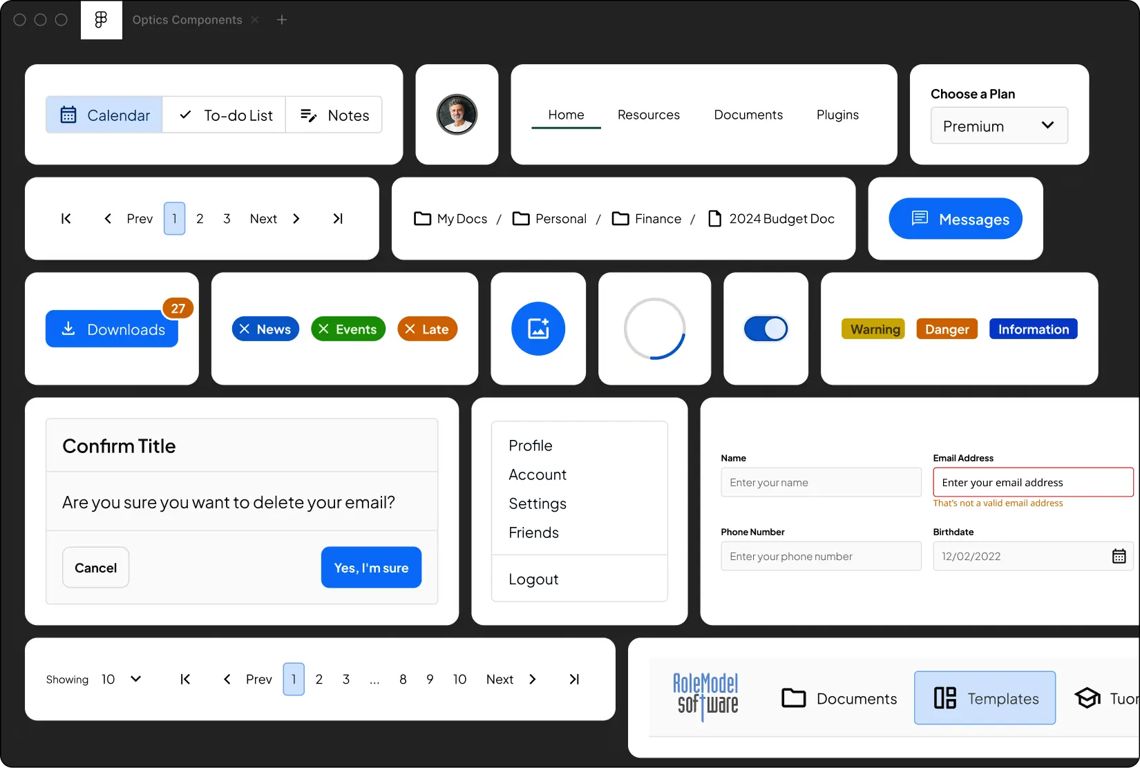
HTML/CSS Components
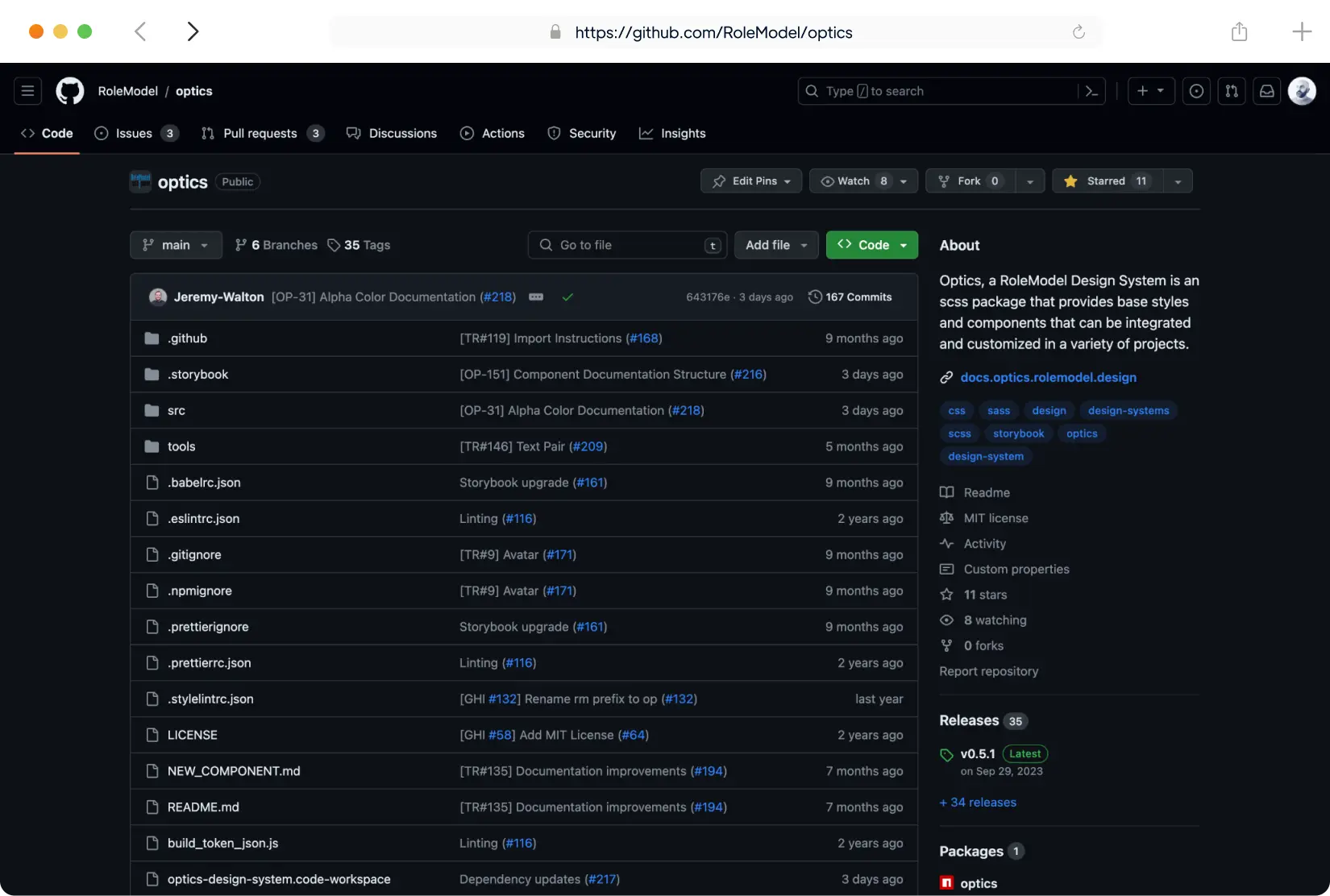
The GitHub repository for Optics serves as an essential resource for our developers. It's a storehouse where all the code related to our design system is regularly maintained and updated. This includes the HTML/CSS components that mirror our Figma files.
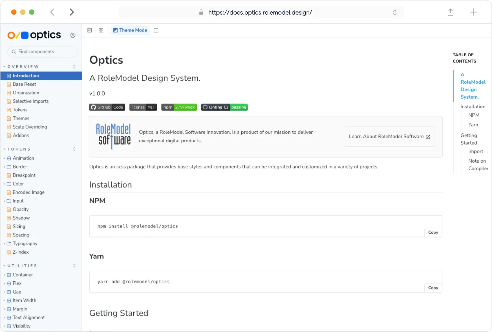
Documentation
Our Storybook documentation showcases Optics' UI components interactively. It serves as a visual library for developers and designers, offering clear representations of each component in different states. Developers can refer to these docs for implementing UI components in their projects.
Our focus on expertise amplification and iterative value led us to build Optics, and we look forward to building upon this design system to serve and delight our valued customers.